Mobile Design
Role
Chief Design Officer
Tools
Paper, Sketch, Google Slides
Date
Jan - Apr 2019
Brief
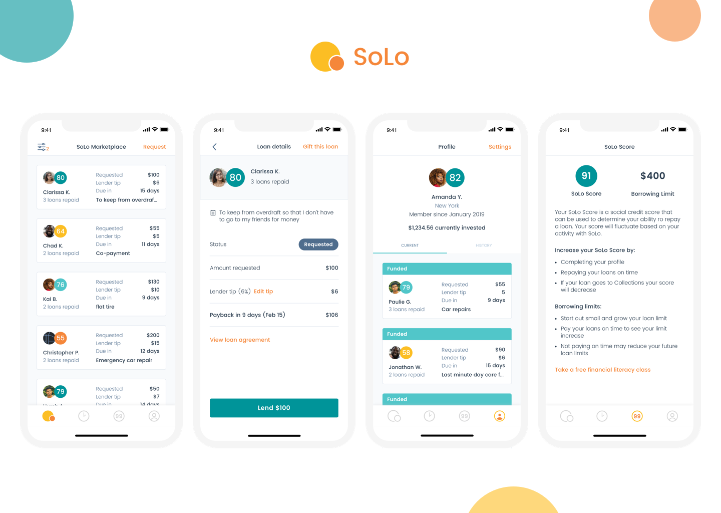
I am a co-founder of SoLo Funds, a peer to peer lending platform connecting every day people to short term loans under $1,000. SoLo’s mission is to empower traditionally underbanked individuals by pairing them with lenders who want to use their discretionary capital to help those in need while making money. We’ve done this by creating a mobile marketplace where lenders can “shop” for loans they’re interested in using the SoLo Score, a proprietary risk indicator, to find loans that match their lending criteria.
We were seeing low funding rates and had heard lots of feedback about users being confused about their loans due to hidden information and unintelligible layout.
The old Loan Details screen (referred to internally as the “treasure map” as compared with the new Loan Details screen with expandable Borrower detail (not pictured here).
Goals
1. Arm lenders with information to make their risk assessment easier
Lenders don’t have visibility into likelihood a borrower will repay a loan
Unintuitive “treasure map” forces lenders to piece together information to get the full picture of a loan
Lack of confidence led to low weekly funding rates
Lack of information led to lower lender satisfaction
Create an experience that keeps lenders coming back
2. Empower borrowers when they’re feeling most vulnerable
No social connection felt to encourage payback or trust
Dates and loan terms are hidden from view when requesting a loan
Make it easy to get financial help when you need it
Create a UI that is supportive but also that gets out of the way
3. Create an experience that scales gracefully
Immaturity of request or fund a loan process prevents users from interacting on SoLo
Increased engagement and future marketing spend pave the way for more users to join SoLo
Current experience is not personal and is hard for us to understand user behaviors
Unusual error handling bolted onto the experience over time
Brittle codebase meant much more time spent fixing bugs
Constraints
Limited engineering resources
The front end engineering team consisted of 2 young developers, one on iOS and one on Android
Engineers were initially focused on other priorities (stabilizing the platform after a blog post went viral and broke us)
No engineering leadership / mentors
Undocumented loan and error states
Important information about all of the possible loan statuses and their repercussions was siloed in different people’s brains across the company
No single source of truth led to fact finding mission to kick off the project
Team
I was the sole designer and project owner. I identified the issues, created a plan, shopped it around for feedback and buy in, and led the project through design to implementation and iteration. Being both the co-founder and sole designer of a small companies means I wear many hats. My ability to generate ideas and advocate for their implementation has allowed me to touch many aspects of the feature development process (and marketing and fundraising, but that’s another story).
My background in front end web development and my experience working closely with development teams enables me to speak on a different level with engineers and to do my own research into SDKs and potential libraries we can use to solve problems. My love of organization and drive to take things through to completion enabled me to guide this project from ideation to implementation.
1 product designer (me)
Chief Product Officer
1 iOS Engineer
1 Android Engineer
1 Backend Engineer
Chief Executive Officer
We are a small team (10 at the time) so most of the company was involved at some point in what was our biggest change yet to the platform
Timeline
4 months
Phase One (1 month) included ideation, discovery, establishing a direction, information consolidation, and getting buy-in
Phase Two (1 month) involved design iteration and user testing as well as engineering engagement on technical feasibility
Phase Three (2 months) included iteration, build time, launch, and release monitoring
Key Learnings
Quickly ballooning project scope required fast action and flexibility
What originally started out as a basic redesign of a single screen turned into a redesign of one of the most prominent and accessed screens throughout our app. I quickly realized the breadth of the project and my organizational skills kicked into gear. By documenting all possible ways a user could see this screen, from loan statuses, user type (lender / borrower), and different access points, I was able to better understand the importance of getting this redesign right.
Upfront information gathering pays dividends
Collecting all possible loan statuses and errors was time consuming and tedious, but enabled me to see the full picture of requirements before getting too far down the design rabbit hole.
The Problem
V1 of our loan details page was lovingly referred to as the “treasure map” because of the winding path users had to take to consume key information about a loan before they choose to fund it. While this screen was live, less than 100 loans per week were being funded. In our discovery user testing, we learned that key pieces of information about the loan like the number of days to payback were missing and that the organization of the information made it very difficult for lenders to identify whether the loan suited their lending criteria.
Research
I set out to redesign the loan details page, but first had to take note of the various paths a user could take to access the page. This included various points within the application, push notifications, and emails sent to both lenders and borrowers. I organized all of these details in a spreadsheet, taking account of all text variations shown to lenders and borrowers in the various states the loan could be in (ie - funded, overdue, collections, errors, etc).
My research into every possible loan status, what is currently displayed to borrowers, what is currently displayed to lenders, and a basic description of what that status means in terms of fees and timelines.
To further help visualize how the loan details screens fit into our application, I created a product map connecting screenshots from the app with arrows.
User Surveys
Once the various states of this page were documented, I listed all information, errors, educational messages, and more that would need to be displayed and began testing out different hierarchies. At this point, I sent out a survey to a few hundred of our existing lenders to find out what information was most important to them while making a lending decision or following up on an existing loan and consolidated the results in a spreadsheet, which I later presented to the team.
Consolidated lender discovery survey results that I used to present to the rest of the team.
Learnings
Part One
Some of the most important information lenders used to determine whether the borrower would repay included previous repayment history and the SoLo Score. Our existing loan details page simply showed “Completed transactions: #” without giving any further detail about the loan amount, whether it was repaid on time, or how recently it was repaid. In addition, the SoLo Score was shown in a very tiny circle that wasn’t easy to read.
At this point I had enough data to begin sketching out various layout options given the hierarchy of key pieces of information. As I thought through how to display information on the loan details page, I also considered how we could revamp how the loan was display on the Marketplace, seeing as that is the lender’s first interaction with the loan and where the most essential information would need to be shown.
Throughout my sketching and ideation phase, I shared various options with our head of product and engineering team to get feedback and ensure we were prioritizing the correct pieces. In these conversations, we decided to focus less on providing a more detailed look into Borrower profiles and focus instead on repayment history.

UI Design
Once I moved towards the UI design, I played around with using new and existing elements. I explored ways of reusing our existing “loan card” element on our marketplace, with the intention of animating the transition from the marketplace to the full loan details card to appear as if it were simply expanding to fill the screen space. I went down this route for a while by playing with the elements on the loan card as well as on the loan details page itself to ensure the two could work cohesively together.
Unsuccessfully attempting to save engineering time by reusing our existing “loan card” from our Marketplace. Quickly realized this was not up to mobile design and accessibility standards.
Learnings
Part Two
I took the existing component from the marketplace and expanded it, which in theory might mean less work for the engineering team, but I quickly realized that the elements on the screen were not optimized for mobile and had tap spaces that were much too small to meet mobile design and accessibility standards. I’ve always found informational rows to be a great way to organize information, especially financial information as it allows easier scan-ability.
Plan to make profile photo clickable to borrower details was cut to reduce scope. Began playing with showing loan repayment on same page and using rows to display information.
“Final” Iteration
Before User Testing
My original thought was that we would make the profile photo clickable to a borrower profile, but after speaking with our head of product and the engineers, we decided to punt on that for the moment due to the already large size of this project. In my design explorations, I began moving away from the idea of expanding the loan card from the Marketplace and continued iterating, but I really liked having the ability to show a snippet of loan repayment history on this page. I took that direction and continued iterating on it. I felt pretty good about the state of my explorations at this point and communicated it around with the team.
Final iteration before creating prototype to then go into user testing with. This version showed the borrower’s loan repayment history on the same page and allowed for easy collapsibility.
Prototyping & User Testing
After getting to a layout that felt good to our internal team, I created a clickable prototype in Invision and went through a few rounds of user testing. Each session was invaluable in helping fine-tune the loan details page. The first few rounds identified some language changes (ex: changing “transaction history” to “loans repaid” to be clearer and shorter) as well as a slight reorganization of information. Originally I had put the loan reason in the collapsible section at the top of the screen, but while this information was not initially identified as a top priority for lenders, after seeing the mock ups the lenders realized that they actually want to see the loan reason at all times, even when the top portion is collapsed.
One of the remote user tests I conducted using an Invision prototype.
“It’s so much nicer to not have to calculate how many days away a February 15th payback is!”
Learnings
Part Three
As I continued user testing, I took a step back to think about the organization of information and realized that it made more sense to focus the top collapsible section on information about the borrower and their past history, while all loan-specific information would live below that. This discovery helped clean up the information density on the page while streamlining where users would look to find different types of information.
Final iteration after multiple rounds of user testing and internal review, which led to a slight reorganization of information on the page (moving the loan reason outside of the collapsible borrower details section at the top).
Execution Options
All at once
Half step
Quarter step
I then worked backwards to identify small steps we could take to incrementally work towards the new design given that we only had 1 iOS developer and 1 Android developer at the time. I presented 3 options to the team (which included the iOS developer, Android developer, backend developer, and head of product) outlining the ways we could achieve the redesign: all at once (band-aid method of ripping it off quickly), a half step, or quarter steps to work incrementally towards the end goal redesign. The developers dug into the details and ultimately preferred doing it all at once, due to the backend dependencies and the brittle front end code that hadn’t been touched in a while.
Throughout the entire project, I documented my thought process, decision making, timelines, open questions, and more in a Design Doc that was shared with the team. Offering visibility into the process helped the team better understand the design process and how we reached certain outcomes, while providing an invaluable opportunity to communicate potential issues as early as possible. I also documented future considerations that we opted not to address with this redesign, enabling me to evaluate future ideas and pick up where I left off when we got around to making additional improvements.
Throughout the project I documented things I tried, required reading / other research, key decision making, open questions, future considerations, and more to make it easy for new people to come onto the project and get up to speed on where we are and how we got there. My Design Docs also allow for me to go back in the future and see where I left off with future considerations and if/how we might pick things up from where we stopped last.
Development & QA
Once we committed to building the new loan details screen, I worked closely with the developers to break out the work into more bite sized pieces and ticketed the work in Asana, our project management tool at the time. We rolled the work out in 3 main parts and I QA tested each piece with each developer in the format that they each preferred. The iOS developer preferred redlining individual screenshots while the Android developer preferred a more fluid conversation through Slack (both developers were remote so pairing in person was not an option, though is definitely my preferred method).
Different styles of remote QA work with engineers who preferred different methods of communication during QA. The iOS engineer preferred redlining screenshots whereas the Android engineer preferred a threaded conversation in Slack.
Launch & Learn
After launching the redesigned loan details page and revamped loan cards on the Marketplace, we went from ~100 to 500 loans funded per week, proving that lenders felt more comfortable funding loans when information is presented in a cleaner way and with additional information about a borrower’s repayment history.
As I’ve continued to have conversations with lenders and borrowers since launching the full redesign and observing how lenders and borrowers use this new layout, I’ve made quick tweaks to the information display here and there. One example of this is revising the way payback dates and late fees are displayed. Previously we would show something like “Payback in 6 days (Jan 15, 2019)” but on smaller devices (like iPhone SE) we noticed that this text would run into the amount on the right. Our immediate fix was to wrap to a new line, but I took another approach that would scale better and dropped in a second line with additional details about the payback date and fees.
In addition, we learned that some of our more financially savvy lenders were creating their own spreadsheets to closely track their loan success rates over time. These lenders typically have 8-30 active loans at any given time and wanted to see some additional pieces of information that we did not originally include. These pieces of information included the date they funded the loan, the dates important fees were charged, and seeing how the payback date fluctuated if the borrower went to rollover. We have since added these fields and our next major release will include additional details about each of our loan statuses to help lenders and borrowers understand more fully what “rollover” and “collections” mean.
A few months after releasing the loan details redesign we’ve noticed slight improvements we could make to the page and have implemented small tweaks here and there. Most notably in this screenshot is moving the fee and payback details to a second line within the row to prevent word wrap or ellipsing on smaller devices.
Summary
As with any product launch, we continue to monitor feedback we hear from reviews in the App Store, user testing we do for other features, and our Customer Success team.
Before I joined the team full time, we had no design system. While working through the redesign of the loan details screens, I began to establish visual components that could be easily reused throughout the rest of the application. I started simple by defining colors, fonts, and buttons before working through informational rows and inputs as I iterated on the loan details screens. As I played around with the UI elements of the loan details page, I continued tweaking the design system components to ensure scalability and accessibility.